ROC AUC
| Created | |
|---|---|
| Tags | Metrics |
ROC curve
- a graphical representation of the contrast between true positive rates and the false positive rate at various thresholds.
- a proxy for the trade-off between the sensitivity of the model (true positives) vs the fall-out or the probability it will trigger a false alarm (false positives)
- true positive rate and false positive rate.
- True positive rate = recall = TP/(TP+FN)
- False positive rate = FP/(FP+TN)
Lowering the threshold allows more items to be classified as positive, thus increasing both true positive rate and false positive rate.
AUC
- "Area under the ROC curve".
- the probability that the model ranks a random positive example more highly than a random negative example.
- the larger the AUC, the better a model is performing.

ROC (Receiver Operating Characteristic) curve and AUC (Area Under the Curve) are evaluation metrics commonly used for binary classification models. ROC curve is a graphical plot that illustrates the diagnostic ability of a binary classifier system as its discrimination threshold is varied. AUC represents the degree or measure of separability of classes.
ROC Curve:
- The ROC curve is created by plotting the true positive rate (TPR) against the false positive rate (FPR) at various threshold settings.
- TPR is also known as sensitivity or recall and is calculated as \(\frac{{TP}}{{TP + FN}}\).
- FPR is calculated as \(\frac{{FP}}{{FP + TN}}\), where FP is the number of false positives and TN is the number of true negatives.
- The ROC curve visualizes the trade-off between sensitivity and specificity of the classifier across different threshold settings.
AUC (Area Under the ROC Curve):
- AUC measures the entire two-dimensional area underneath the ROC curve from (0,0) to (1,1).
- AUC provides an aggregate measure of performance across all possible classification thresholds.
- AUC ranges from 0 to 1, where a higher AUC value indicates better classifier performance. A perfect classifier has an AUC of 1, while a random classifier has an AUC of 0.5.
Interpretation:
- An ROC curve that lies closer to the top-left corner indicates better classifier performance, as it corresponds to higher TPR and lower FPR across different threshold settings.
- AUC can be interpreted as the probability that the classifier will rank a randomly chosen positive instance higher than a randomly chosen negative instance.
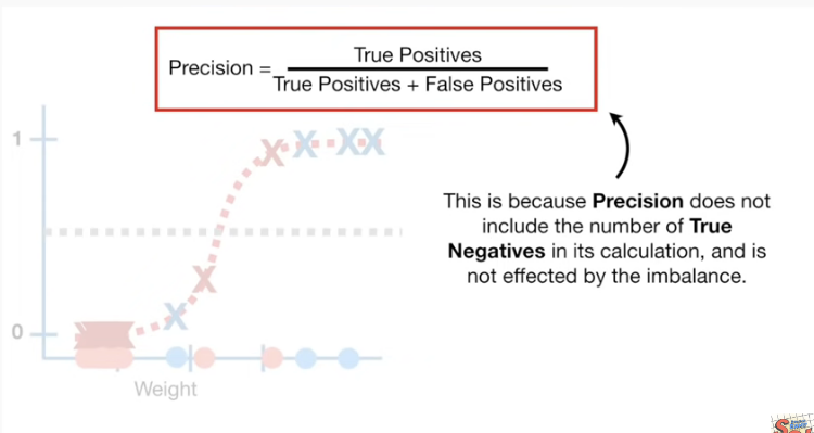
- AUC is a useful metric for imbalanced datasets, where one class is much more prevalent than the other.
Python Implementation (using scikit-learn):
from sklearn.metrics import roc_auc_score

# Example ground truth and predicted probabilities
y_true = [0, 1, 1, 0, 1]
y_prob = [0.1, 0.9, 0.8, 0.2, 0.7]  # Predicted probabilities of positive class

# Calculate ROC AUC score
roc_auc = roc_auc_score(y_true, y_prob)

print("ROC AUC Score:", roc_auc)
In this example, y_true contains the true labels of the samples (0 for negative class and 1 for positive class), and y_prob contains the predicted probabilities of the positive class. We calculate the ROC AUC score using the roc_auc_score function from scikit-learn's metrics module.